


龙液酸汤乌鱼
艾茵·兰德认为:“人之所以对艺术渴望,在于他的对世界的认知是概念性的,也就是说,他通过对抽象的理解来掌握知识,同时需要某种力量将这个广阔的抽象世界变成可以感知的意识。”
According to Ayn Rand:"The reason why people want art lies in his conceptual cognition of the world, that is, he can master knowledge through his understanding of abstraction, and at the same time, he needs some strength to make this broad abstract world a perceptible consciousness."

龙液品牌自经营以来,以乌鱼作为品牌的主要卖点,古有云:鳢首有七星,形长体圆,头尾相等,细鳞、色黑,有斑花纹,颇类蝮蛇,形状可憎,南人珍食之。即讲述的是乌鱼的特性,无刺而又滋补。此次品牌VI和空间全新升级,委托人邀请我们量身打造一个年轻化的品牌调性,且老少皆宜,让品牌有辨识度,有记忆点。
Since the operation of longye brand, mullet has been the main selling point of the brand. As an ancient saying goes, snakehead has seven stars on its head, long and round in shape, with equal head and tail, fine scales, black color, and spotted pattern. It is quite like agkistrodon, with an abominable shape and is eaten by people in south China. It is about the characteristics of mullet, thornless and tonic. The brand VI and space are upgraded. The client invited us to create a young brand tone suitable for both young and old, so that the brand can be recognized and remembered.
BRAND DESIGN
-
品牌设计
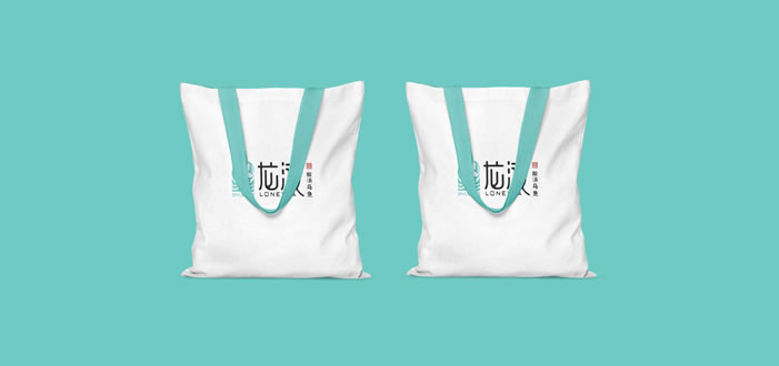
设计师在logo的设计上,运用主打产品乌鱼的图形作为品牌标志。选取水“液态”的寓意,让字体的形状及笔画更加的圆润,品牌名称在感官上即保证了辨识度,又使其柔和。
In the logo design, the designer uses the graphic of the main product mullet as the brand logo. The meaning of water "liquid" is selected to make the shape and strokes of the font more mellow. The brand name guarantees the recognition and makes it soft in the sense.
图片
设计师的联想从“鱼”,到“水”,再到“色”。品牌色作为视觉传达的第一要素,不仅要年轻化,还要受大众喜欢,在对比了多种蓝色后,最终选取了年轻的,干净的近似于Tiffany蓝的色调。
Designers' associations ranged from "fish" to "water" and then to "color". As the first element of visual communication, brand color should not only be younger, but also be liked by the public. After comparing a variety of blue colors, the brand finally chooses a young and clean color similar to Tiffany blue.


SPACE DESIGN
-
空间设计
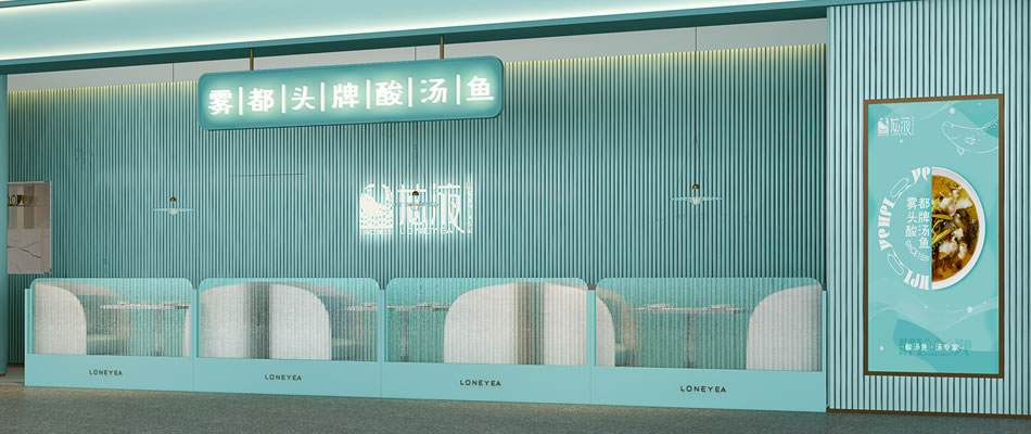
餐厅位于光环购物公园的5楼,整个形状也类似于鱼的形态。平面格局呈多边角的异形状,增加了设计的难度,不过好在餐厅有一面很好的采光,不用担心采光的问题。
Located on the fifth floor of Halo Shopping Park, the restaurant is also shaped like a fish. The plane pattern shows the different shape of many sides and corners, increasing the difficulty of design, but it is good that the restaurant has a very good lighting, do not worry about the problem of lighting.

设计师在对整个空间设计的时候,用了大片的蓝色,让这个鱼形的餐厅徜徉在水的世界中。采用以空间美感为主、产品为辅的设计手法,展现空间的艺术感、层次感、空间感,提炼更纯粹更高端的空间艺术。以有逻辑性的展示体系解构并重新定义空间,这是空间自我意识觉醒的美妙过程。
In the design of the whole space, the designer used a large blue, so that the fish shaped restaurant in the world of water. Adopt the design technique based on the aesthetic feeling of space, supplemented by products, to show the sense of art, sense of hierarchy and sense of space, and refine the more pure and high-end space art. Deconstructing and redefining space with a logical display system is a wonderful process of self-consciousness awakening.


设计的魅力渗入错落有致的空间,
向我们无声地展示它独有的气质。
the charm of design infiltrates into the space of well arranged,showing us its unique temperament silently.
Brand|龙液酸汤乌鱼|2020
Location|光环购物中心·重庆
Area|235m²
VI Design|张华东
SI Design|蒋金成
Owned Company|空袋子设计